
Bookabus.com
UX-Design - LIA project
User research / Booking flow

My Role
- UX Designer
- UX Writer

Team
- 1 UX Designer (me)
- 1 Full stack developer

Project time
8 weeks
Autumn 2024

Tools
- Figma
- FigJam
- Canva
- Color.Review
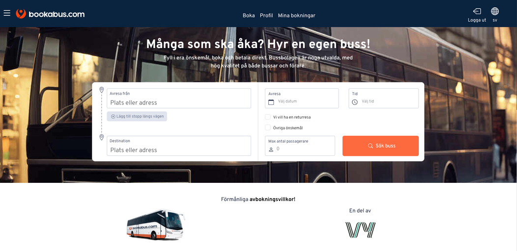
THE SITUATION
Bookabus.com needed to define the problem with their booking flow.
They struggled with things like:
- People doesn´t understand what the booking is for.
- Lot´s of people reach the website but nearly everyone drops off early in process.
- A very small budget.
THE WORK
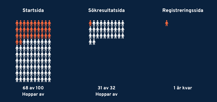
The definition of my work was to detect the problems, where do people drop off the most? Why? As the site was already designed and up and running, my role was to make it more usable and intuitive. The strongest word of my research was "Communication", how does the website communicate with the users? My challenge was to create small adjustments that lead to big changes due to the small budget in the poject.
User Observations
Detected frustrations:
- Nobody read the information text above the search-field.
- Everybody struggled with password registration.
- The users got confused about pop-ups and the lack of confirmations during the booking flow.
1.
START PAGE / WHAT I DID
-
Shortened the information text and made it bigger When a human brain´s recognize something, in this case a search field, everything else have to be very eye catching to make the users see that part aswell as the search field.
-
Lowered the contrasts in image The image beneath competing too much with the text.
2.
PASSWORD REGISTRATION / WHAT I DID
-
Changed the fields from two to one The users doesn´t have to repeat the password again.
-
Letting the users know When their choosen password included the right amount of different characters and letters.
3.
LACK OF COMMUNICATIONS & FRUSTRATING POP-UPS / WHAT I DID
-
Changed the information text It´s important to communicate with the users, but some information can frustrate rather than help.
-
Designed a confirmation pop-up When the users had made an action they where directly lead into an new page without any explanation. I added a pop-up window with a "Thank you! ..."
1. Before 2. After


Before / After


Before / Iteration 1 / Iteration 2


Confirmation

Before / After


Interface


PRACTICAL UX DESIGN WORK
- Observations - I documented and analyzed test persons who never seen Bookabus.com before, while they tried the staged version. Their task was to make a reservation.
- Impact mapping - Who are the users?
- Figma - redesigning some parts to make it clearer for the users
- Surveys - Sent out to volunteers that wanted to make a fictitious booking, and then answer some questions.
- UX-Writing - Broadened communication with the user with short and concise texts.
FINAL OUTCOME
What we finally achieved with the work was to increase the users' understanding of what the site is for, as well as ease frustrations with clear flow and communication about what comes next. With small adjustments make big changes.