PARENT COOPERATIVE SITE
GRODDEN - School project
Redesigning the interface of Grodden.org
My Role
- UX/UI Designer
- Scrum Master


Team
- 1 UX Designer
- 5 students working Agile

Project time
Approximately 5 weeks
Spring 2024

Tools
- Figma
- FigJam
- Canva
- Agile Methods
- Trello
THE SITUATION
Parents find it difficult to adopt the purpose of Grodden's parent cooperative without carefully exploring the website. While Grodden has strong visions and a dedicated team passionate about the future of children, it remains a challenge to effectively communicate this energy on their website.
THE WORK
After analyzing the website's structure and its intended message, I employed three heuristics. Utilizing these heuristics, I redesigned the website interface to effectively showcase the association's values and objectives.
HEURISTIC EVALUATION
The Heuristics I used:
- Consistency and Standards
- Flexibility and Efficiency of Use
- Aesthetic and Minimalist Design
1.
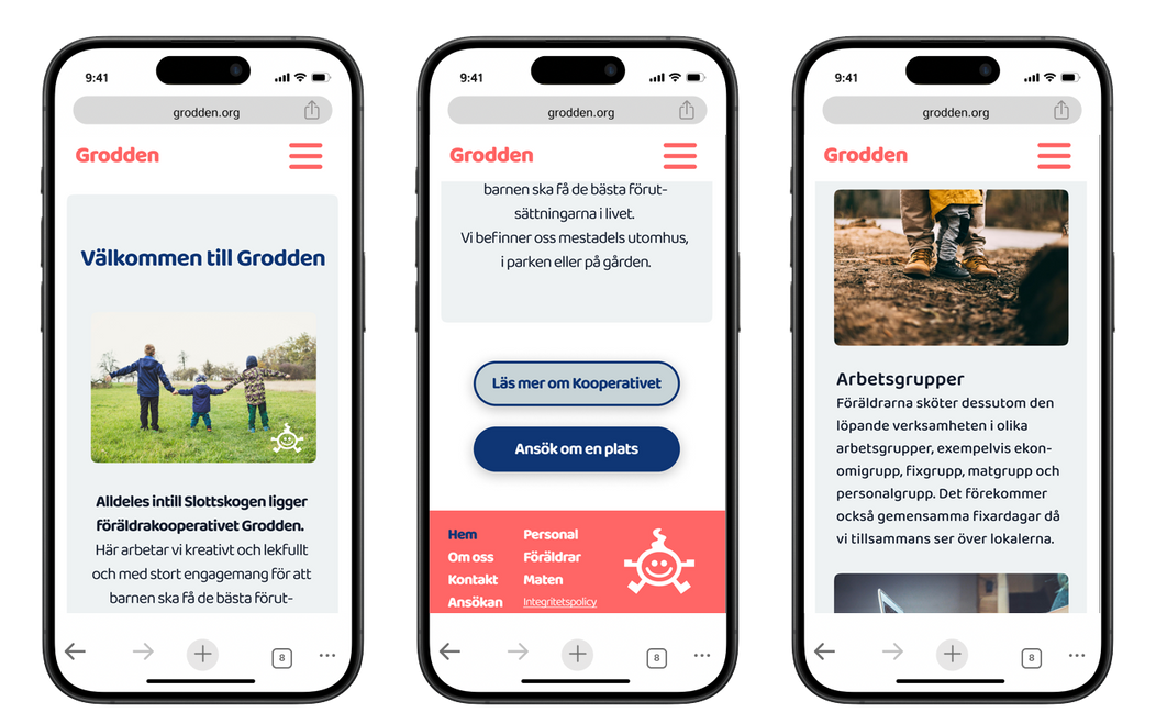
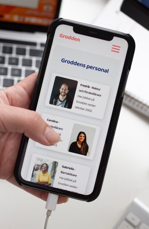
CONSISTENCY AND STANDARDS
-
Transparent Communication Users are guided through clear, concise messaging, ensuring easy understanding of the content.
-
Unified Design Elements Consistent font styles, color palettes and informative subheadings maintain coherence across the platform, enhancing user experience.
-
Integration of External Links Former external links are seamlessly integrated into the website, eliminating disruptions and providing a smoother browsing experience.
-
Familiar Structure The website follows a well-known layout, placing information exactly where users expect it. This reduces surprises, allowing visitors to easily navigate through the site's content.
2.
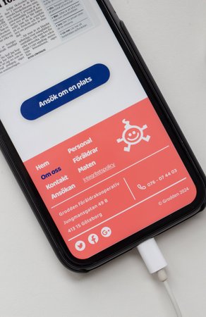
FLEXIBILITY AND EFFICIENCY OF USE
-
Several Paths Users have the option to choose between a longer or shorter route to their destination.
-
Location Knowledge Users can easily determine their location on the website.
-
Intuitive Navigation Buttons include clear, descriptive text, guiding users effortlessly through each stage of their journey.
3.
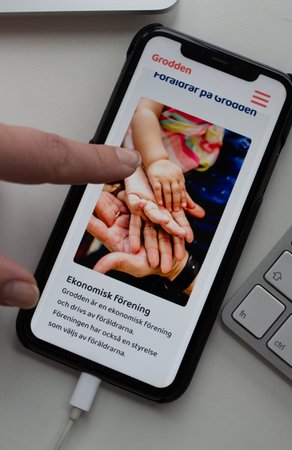
AESTHETIC AND MINIMALIST DESIGN
-
Color and Contrasts The color scheme is limited of five colors including white and black.
-
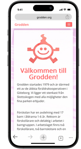
Streamlined information The initial page is succinct, highlighting the key attributes of the cooperative while offering shortcuts to both the application and further details.
-
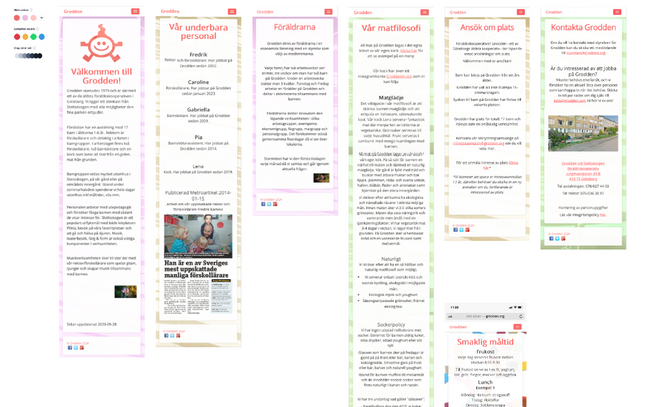
Structure and Balance Given the limited content to scale down, I've ensured users can absorb all information without fatigue. By incorporating diverse images, text, and headings, users can easily discern what interests them most and decide if they want to be part of the cooperative.
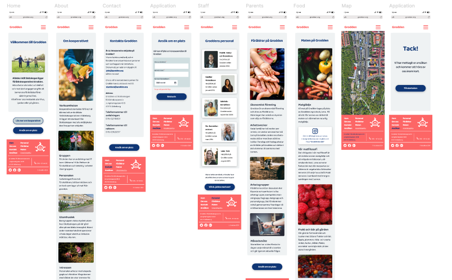
PRACTICAL UX DESIGN WORK
In Figma, I utilized the HTML.To.Design plugin to import the current website. From there, I created an initial prototype, refining it through iterations based on heuristics. Since no existing components were available, I designed new ones for the interface. I iterated on the second prototype multiple times until reaching the final version.
FINAL OUTCOME
As a visitor, you swiftly grasp the essence of the business, even in a brief visit. Navigating to your desired destination is effortless, ensuring you stay engaged and avoid frustration.